|
Noise Contouring of Measured Data Navcon Engineering measured Sound Pressure Levels within a plant. Data was processed with the SoundPLAN Cartography Module [High sound levels : red / blue color Lower sound levels: yellow / green colors]. The noise survey was repeated after a period of 6 years. The noise difference between the two data sets were computed and plotted as a Difference Map. |
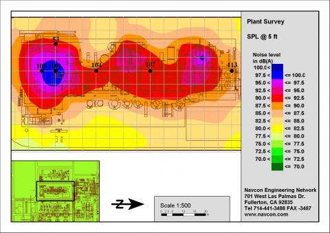 |
Black lines: DXF outline of Refinery Data acquired every 20 ft, 5 ft above the ground. Colors indicated the Sound Pressure Level (Red high levels and Green low levels) [Note: The DXF plant layout is superimposed on top of the map to pin point source in respect to the measured noise levels.] |
|
|
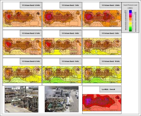 |
Black lines: DXF outline of Refinery Data acquired every 20 ft, 5 ft above the ground. Contouring Spectral Data : The data was collected in 1/3 octave band within a plant. The data was also processed to visualize the magnitude of the noise levels on a frequency by frequency base. The map shows the 1/3 octave data set from the 1.6 kHz to the 10 kHz. [Note: The DXF plant layout is superimposed on top of the map to pin point source in respect to the measured noise levels.] |